Overview
A student-led project to design and develop a financial app tailored to the needs of UW students, aimed at providing a more engaging experience for budgeting finances through the university’s husky mascot. 🐶💰
The final deliverable was an interactive prototype, showcasing key features such as budgeting tools, goal setting, and visual progress tracking—offering students to manage their finances in an enjoyable, cute and gamified way.
Inquiry
Objective: Financial stress has a huge impact on students, and has a great effect on their mental health and wellbeing. 💚 For this project, our team wanted to develop a financial phone application targeted specifically for students of the University of Washington that would help them "play with the idea of budgeting" in a way that is simple and stress-free. 🐶💸
Summary of Interview & Research: Our team talked to several college students. Those who have used financial apps before stated they did not like the complexity of them and find them intimidating to use. 😬
List of wants (by students):
• Simplicity and easy usability
• Incentive to use
• Aesthetically pleasing / fun
• Categorization of different expenses / budgeting mechanic
• Progress reports / spending trends
• Privacy/security of information
• Financial resources
• Incentive to use
• Aesthetically pleasing / fun
• Categorization of different expenses / budgeting mechanic
• Progress reports / spending trends
• Privacy/security of information
• Financial resources
Branding

One of the first things created for the project was a mood board to get a feel of the overall visual look.
Visual Look & Feel Checklist:
• Color Palette — UW colors (Purple, Gold, Gray, White, Black)
• Visual Design — fun, playful, non-intimidating
• Modern — clean lines + shapes, sans-serif type (?)
Visual Look & Feel Checklist:
• Color Palette — UW colors (Purple, Gold, Gray, White, Black)
• Visual Design — fun, playful, non-intimidating
• Modern — clean lines + shapes, sans-serif type (?)
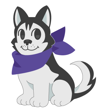
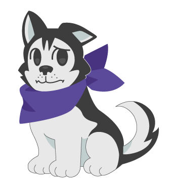
Husky avatar
What we decided would be the biggest appeal for the app was incorporating an avatar that interacts with the user. 🐶🧑🎓 We chose a husky is because it is the official UW mascot (and also because dogs are generally considered to be cute and non-intimidating 💖).
I played around with a Japanese chibi-styled dog, as well as a more western cartoon look. I refined the look based on feedback from classmates. A mix of the two, with a leaning towards the Japanese cartoon aesthetic, was preferred.
🐾
These are the initial concepts I drew for the application: ✏️
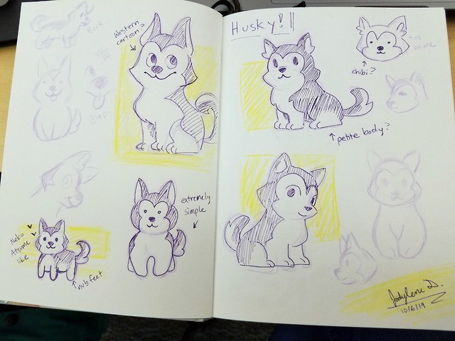
Avatar concepts
Avatar concepts (2)
Husky expression sketches and finals:

Neutral sketch

Happy sketch

Concerned sketch
Neutral final
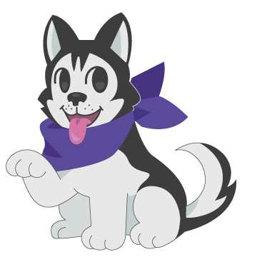
Happy final
Concerned final
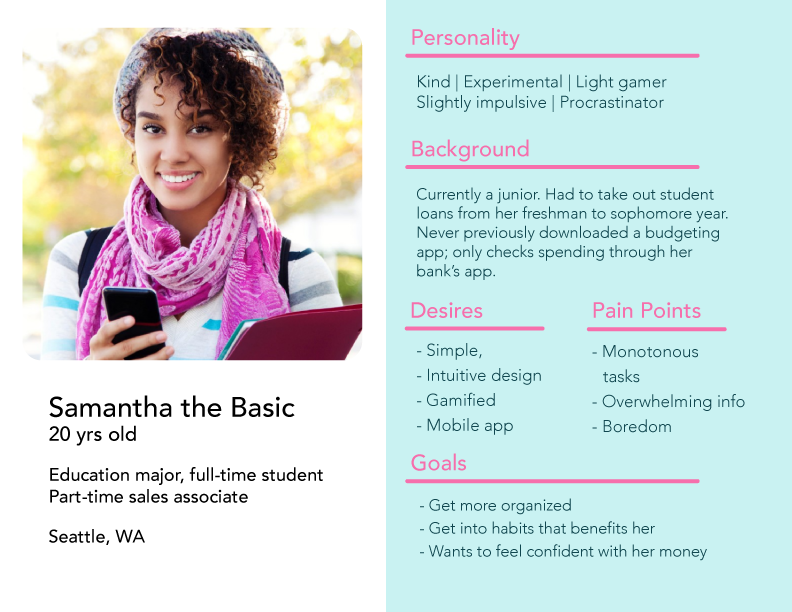
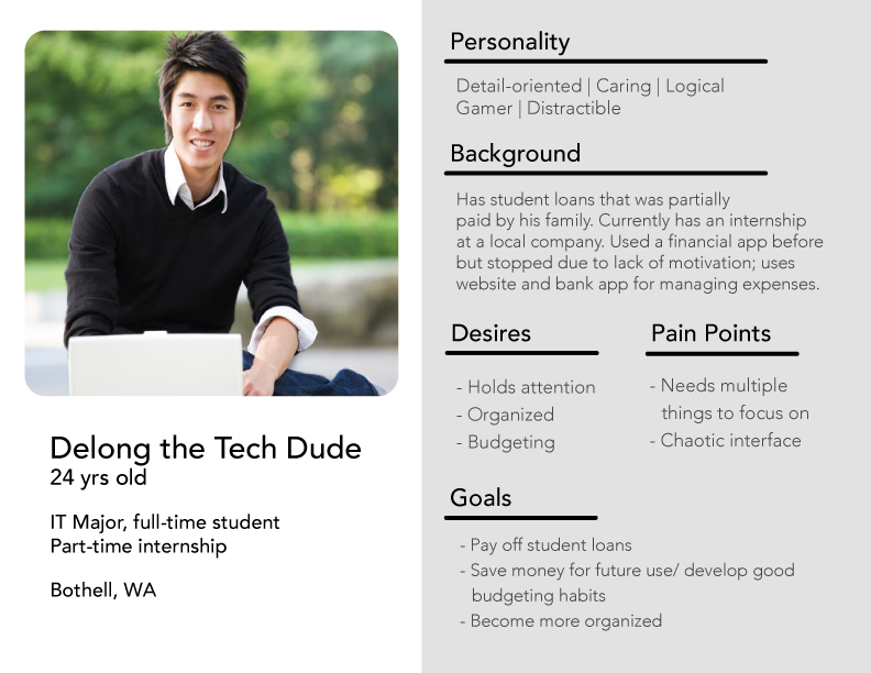
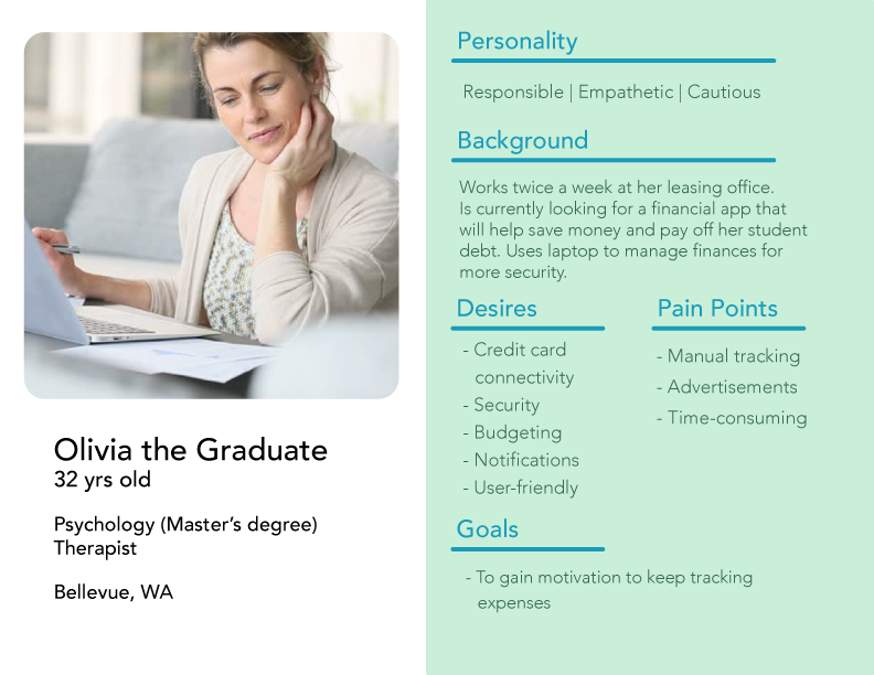
Personas
We created three personas for our project. 👥 Our persona "Samantha"—a typical college student who likes games and struggles financially—was considered our top priority.
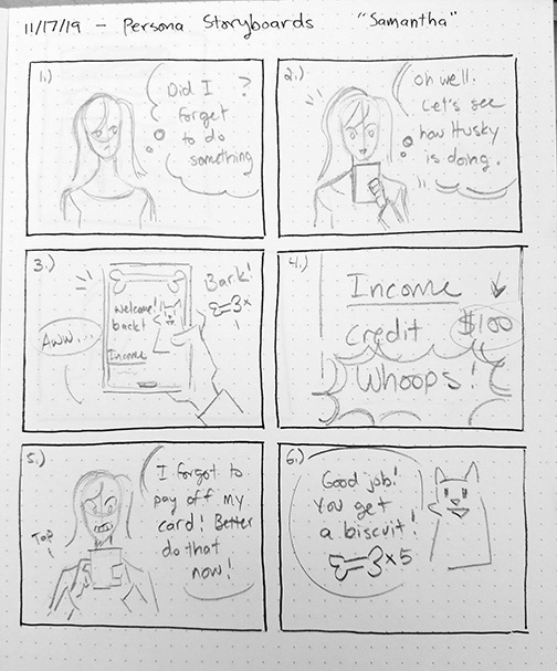
User scenario
A storyboard of a user scenario I created for persona "Samantha" focused on what it would be like for a student who has already used the application for a period of time. ⏱️ Deciding to showcase various expressions throughout the scenario was important for us so people could clearly see Samantha's emotional journey. 📈
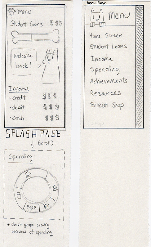
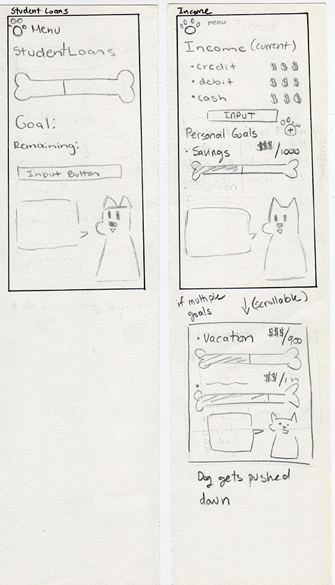
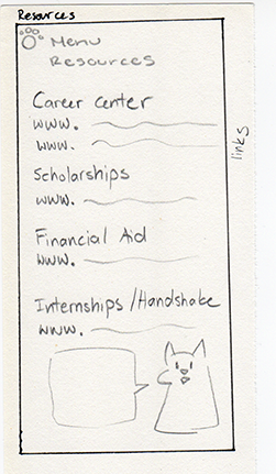
Wireframes
Low-fidelity wireframes our team created; what we wanted to keep consistent was having the husky be on every page so it could provide useful or interesting commentary to read. 🐶
Two unique features of the app would be:
• A resource page tailored specifically for student needs (financial-based)
• A section to redeem awards given to students for consistent app use (husky avatar customization)
• A resource page tailored specifically for student needs (financial-based)
• A section to redeem awards given to students for consistent app use (husky avatar customization)
Wireframe 1
Wireframe 2
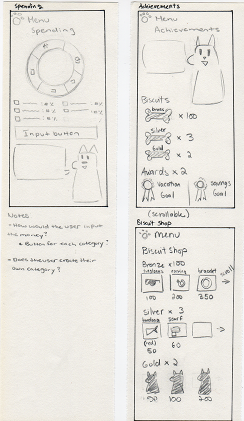
Wireframe 3
Wireframe 4
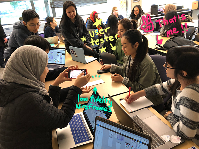
Usability Testing
Notable feedback from testers were the varying opinions on how often they would personally use the app and that we would need to adjust the gamification aspect (i.e. how dog biscuits would be earned 🦴). There was also some confusion on which graphics were clickable and how information can be input. 🤷 Testers reacted positively to the layout and especially the avatar. 👍
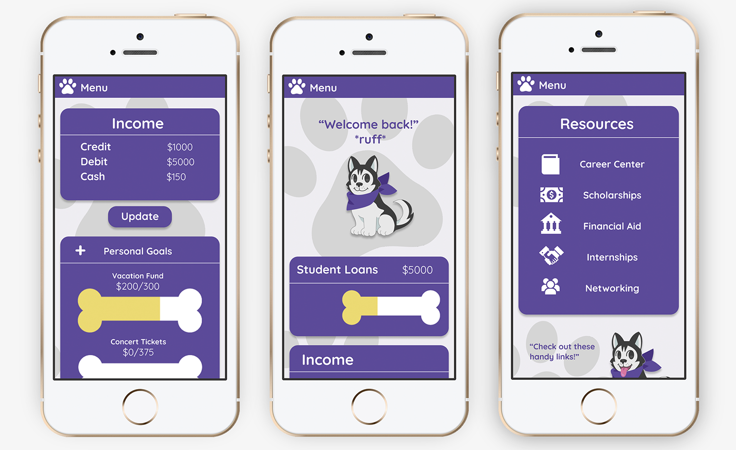
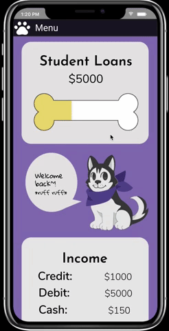
1st prototype
The initial high fidelity prototypes created together by the team:
2nd prototype
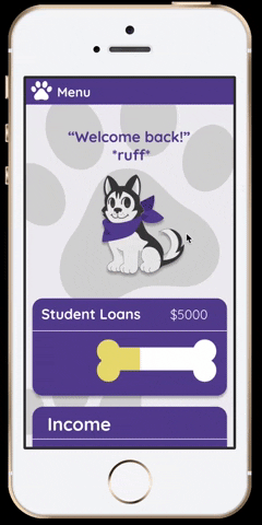
After taking another look, we decided a redesign of the prototype was necessary. We researched various different financial apps and took notes on the UI design. 🔍 A common theme was rounded rectangles to section off different categories of information and having some sort of background element. Adding paw prints to the background helped fill the white space around the avatar while keeping the look fun. Making the boxes a darker color helped showcase UW's branding more successfully. 🐾
Final thoughts
The overwhelmingly positive feedback we received on the concept fueled our motivation and confirmed that we were addressing a real unmet need among students. 🎯 Our goal was to turn this project into a functional application and resource for UW students, with support from the university. Additionally, we explored the potential of releasing the product as a white-label solution for other colleges to adopt.
All in all, this was a formative experience in simulating professional product development within a collaborative setting. On my end I was able to further hone my visual design skills as well as utilize best UX practices and research. 🌱